Timeline Design Customisation
Notes, documentation, and best practices for customising any timeline

Written by Jaykay Kayode
Updated at March 9th, 2026


Table of Contents
In this section, you have the freedom to customise the appearance of how your timeline will look. We'll take care of the implementation based on your preferences. This allows you to visualise how your brand will seamlessly integrate into the Bolt app.
Figma File can be found here.
Please make sure to create a copy of the file before you begin. You can learn how to duplicate a file here
Defining your bottom navigation
Navigation bars provide a persistent and convenient means to switch between primary destinations within an app. It is generally recommended to have 3-5 destinations in the navigation bar.
Please decide on the number of destinations you prefer and update the design accordingly by increasing the number of segments.

This file offers a wide selection of icons to customise your navigation bar. Simply click on a specific segment, and in the properties panel to the right, you can change the icon by selecting your desired option from the dropdown menu. Enjoy personalising your navigation bar with the perfect icons! You can also modify the label text, update the style, and adjust other properties as well. Feel free to personalise your navigation bar to your heart's content!

Defining your timelines
Tabs organise and support navigation between groups of related content at the same level of hierarchy. So on your homepage you can have various tabs as much as you want.
Add and name your tab groups
To add more tabs to the tab group, Select the Layer Tab group to the right panel and hit CMD+D (on mac) or CTRL+D (on windows).
To name your Tabs, Click on a tab and to the right panel, change the Label to your desired text e.g Science

Defining your timeline content
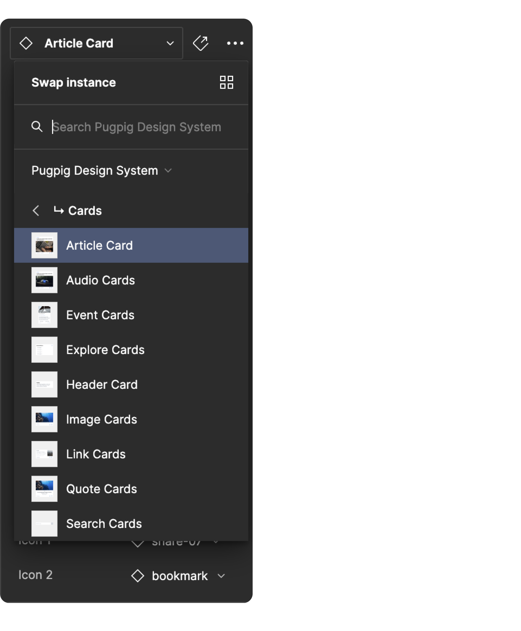
The Bolt app offers a variety of cards that make up the content of your timelines. In this file, we have included a single card type with multiple variants. You can use these variants to customise the appearance of your timeline based on the type of content.
The card in this file is an article card, which is the standard and most commonly used card type for delivering content to your users. To customise its appearance, simply double-click on the card and make the desired changes through the properties panel.
Through the properties panel, you have the flexibility to modify various aspects of the card. You can change the card type, show or hide sections, flashes, images, and much more. Additionally, you can update the card title, add a timestamp and read time, and include or remove the desired icon type.
Explore a quicker option by using the keyboard shortcut SHIFT + I to access the resources tab. From there, easily search for card types and simply drag and drop them into your mobile frame. It streamlines the process, saving you time and effort.
Enjoy the freedom to create visually appealing and tailored timeline cards that suit your content perfectly!

To add more cards to the timeline, simply double click on the article card and press CMD+D (on Mac) or CTRL+D (on Windows). This action will add another article card to the timeline.
If you wish to change the type of the card, navigate to the properties panel and click on the dropdown menu of the article card. From there, you can select from a list of available card types. Feel free to explore and choose the card type that best suits your needs.
Another way to add cards is to use the keyboard shortcut SHIFT + I to open the components library. Search for "cards," choose the desired card type, and drag and drop it into your mobile frame.