Getting Started with Bolt customisation
This article offers step-by-step guidance to help you become quickly acquainted with a new topic.
Table of Contents
Welcome to the Pugpig Design Kit! With this kit, you can easily customise the look of your app, and we'll take care of the implementation based on your preferences.
The design kit Figma File can be found here. Please make sure to create a copy of the file before you begin. You can learn how to duplicate a file here.
The Pugpig Design Kit is set up to take you through every single out of the box design and structure choice needed to build your app. Should you wish to venture beyond these standard features, we encourage you to contact your Customer Success Manager (CSM) or Project Manager, especially if you're already involved in custom work, to express your specific needs.
However, please note that for certain native elements such as onboarding screens, settings pages, audio players, paywalls and subscriptions, tab bars, and timeline picker, we do not offer custom work. But your feedback is invaluable in enhancing these features to better meet your requirements.
Defining your colour palette
A colour palette is a collection of colors that complement each other, forming a cohesive brand or concept. Our design kit provides a deliberate set of color styles that serve as an excellent foundation for your brand or project.
How to change colour styles
Styles provide a way to define a collection of properties that can be shared across designs within a team. This feature is especially useful for defining common aspects such as colours, typography, and shadows.
For any brand or project, This design kit comes with a well-organised and purposeful set of colour styles, making it an ideal starting point.
Making changes to these styles or the colours you'd like to use as the primary or "brand" colour for your project is easy. Here are the steps:
Click outside the frames on the design file to bring out the styles menu. When you do, the properties panel should look like this:
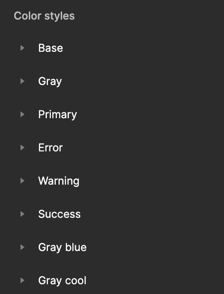
Open the colour style edit menu
Open the edit dialog by clicking on the edit style icon next to the style:
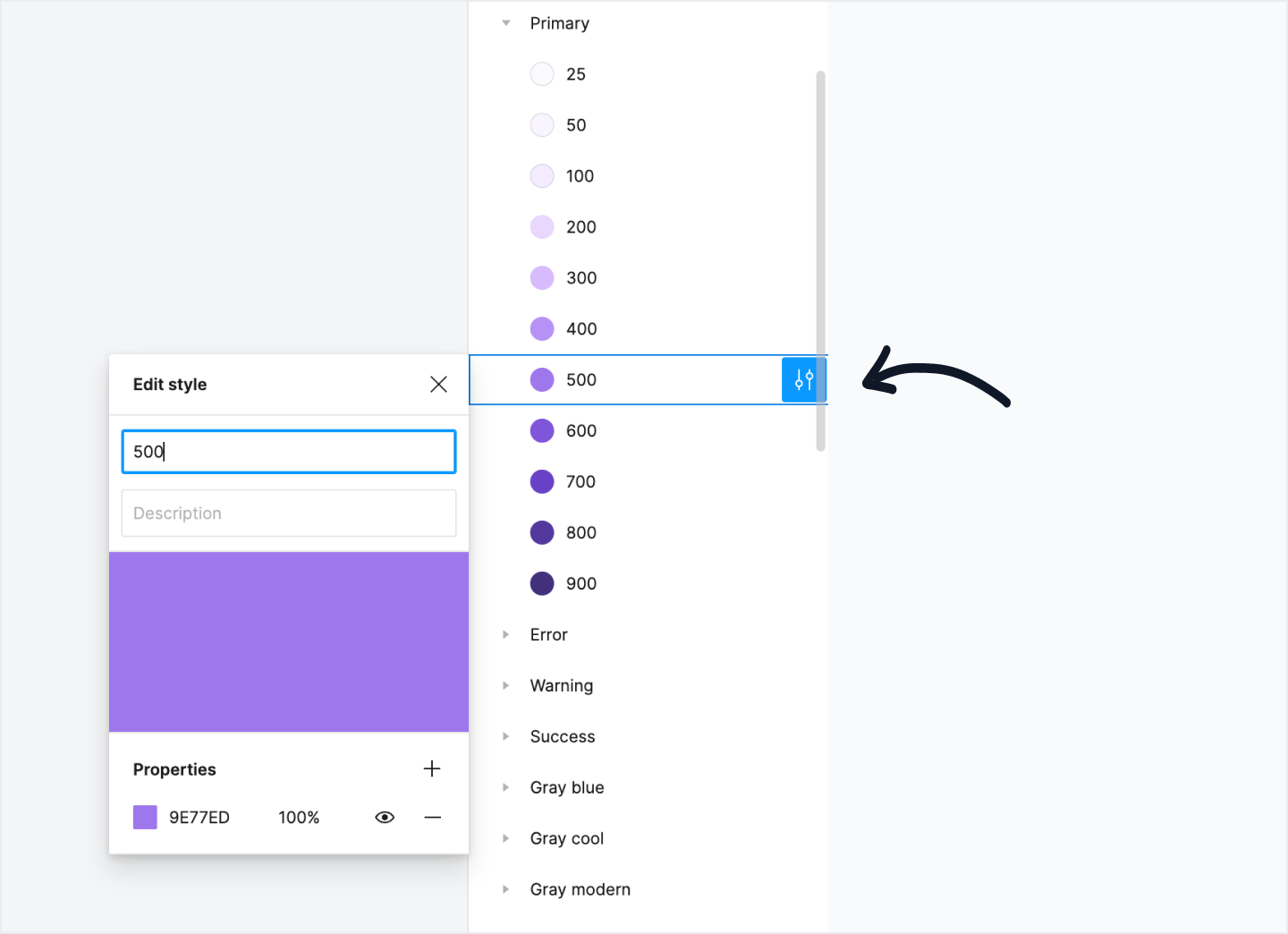
Change colours or styles
From here, you can change the colour style properties and these changes you make here will cascade down to every component and design the colour is being used.
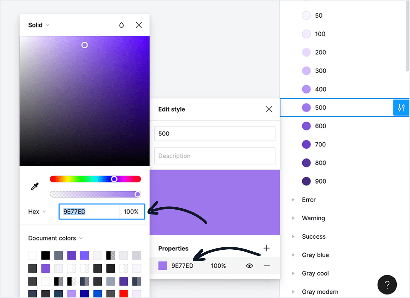
Repeat for all colour styles
If you're changing the colours for your particular project, it's a good idea to change all colour styles at once, rather than just changing them as you're using them. This will keep everything neat and tidy and will ensure you won't miss any.
For larger projects, Figma can take a while to update some styles as they have to cascade down through every component they’re used in. It’s a bit of a pain, but worth it when it’s complete!
Bonus Tip: If you want to change the default colour (purple) over to another colour already in this design kit, just change the “primary” colours styles (rather than switching individual components over to the new colour).
This will ensure everywhere purple is used will get updated to your new colour automatically.
How to change text styles
Open the text style edit menu
Open the edit dialog by clicking on the edit style icon next to the style:
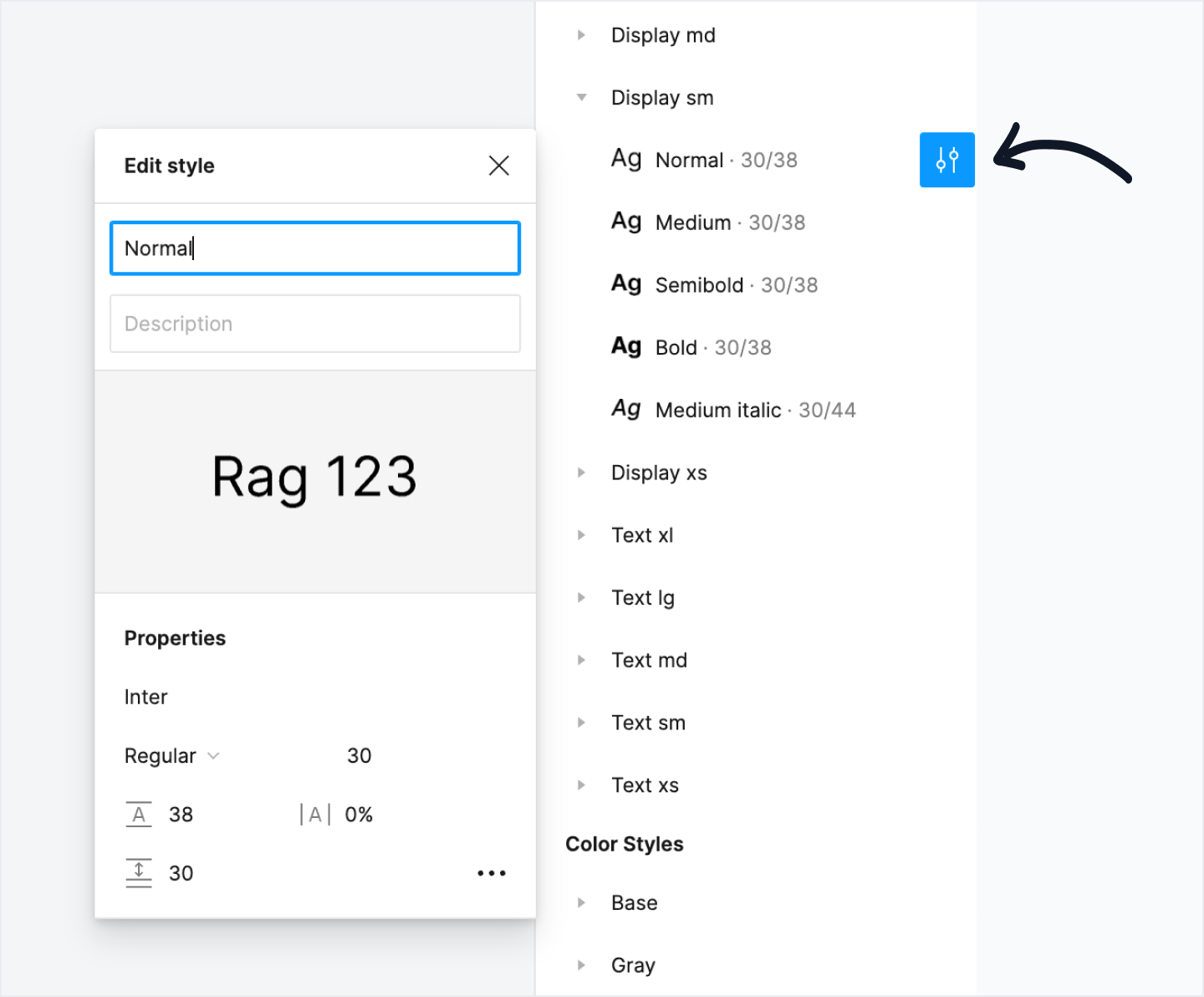
Alternatively, you can click on any type element in a design, quickly find the type style and click on the Edit style icon from there:
From here, you can change any of the text style properties — typeface, font size, line height — and these changes you make here will cascade down to every component and design the type scale is being used.
Using Circular as your brand typeface? Easily switch it out in seconds:
While changing your brand typeface is a necessity, we highly suggest giving the Untitled UI default font sizes and heights a chance before changing them out. It’s a scaleable system that has been tried and tested across hundreds of designs and we hope you’ll find it robust and flexible enough to fall in love with.
Repeat for all text styles
If you’re changing the typeface for your particular project, it’s a good idea to change all text styles at once, rather than just changing them as you’re using them. This will keep everything neat and tidy and will ensure you won’t miss any.
For larger projects, Figma can take a while to update some styles as they have to cascade down through every component they’re used in. It’s a bit of a pain, but worth it when it’s complete!
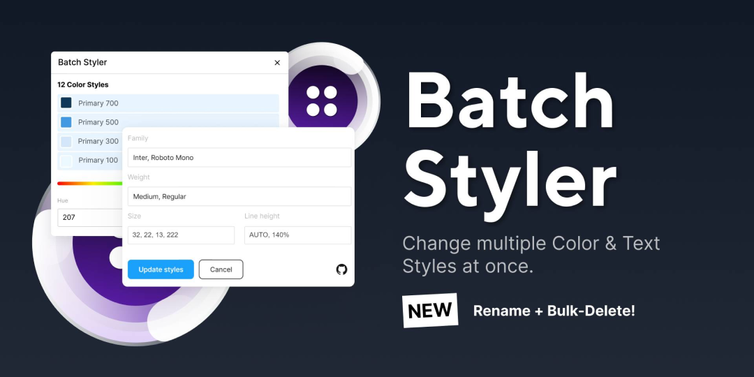
Bonus Tip: You can save a bunch of time updating text styles by using a handy Figma plugin called Batch Styler by Jan Six. This plugin allows you to change multiple colour and text styles at the same time, which saves you heaps of time when bulk updating styles for a new project!
