The Bolt Apps

Written by Benji Weiser
Updated at June 27th, 2023


Table of Contents
Pugpig Bolt has many different screens, journeys and configurations that you can present to your users. In this article we'll go through what options you have over them.
Launch animation
We support Lottie launch animations if you have the ability to create them. These will be shown to users every time they return to the app after a reasonable period of time.
Hard paywall
If you've opted for a hard paywall, or registration wall, this will be seen straight away (after the splash screen if you have one), without any options other than to log in.
We strongly discourage hard paywalls. It's quite tough to get apps through Apple review with them, and it's not a great experience for users, especially if something goes wrong and they don't have access to app settings.
Welcome screens
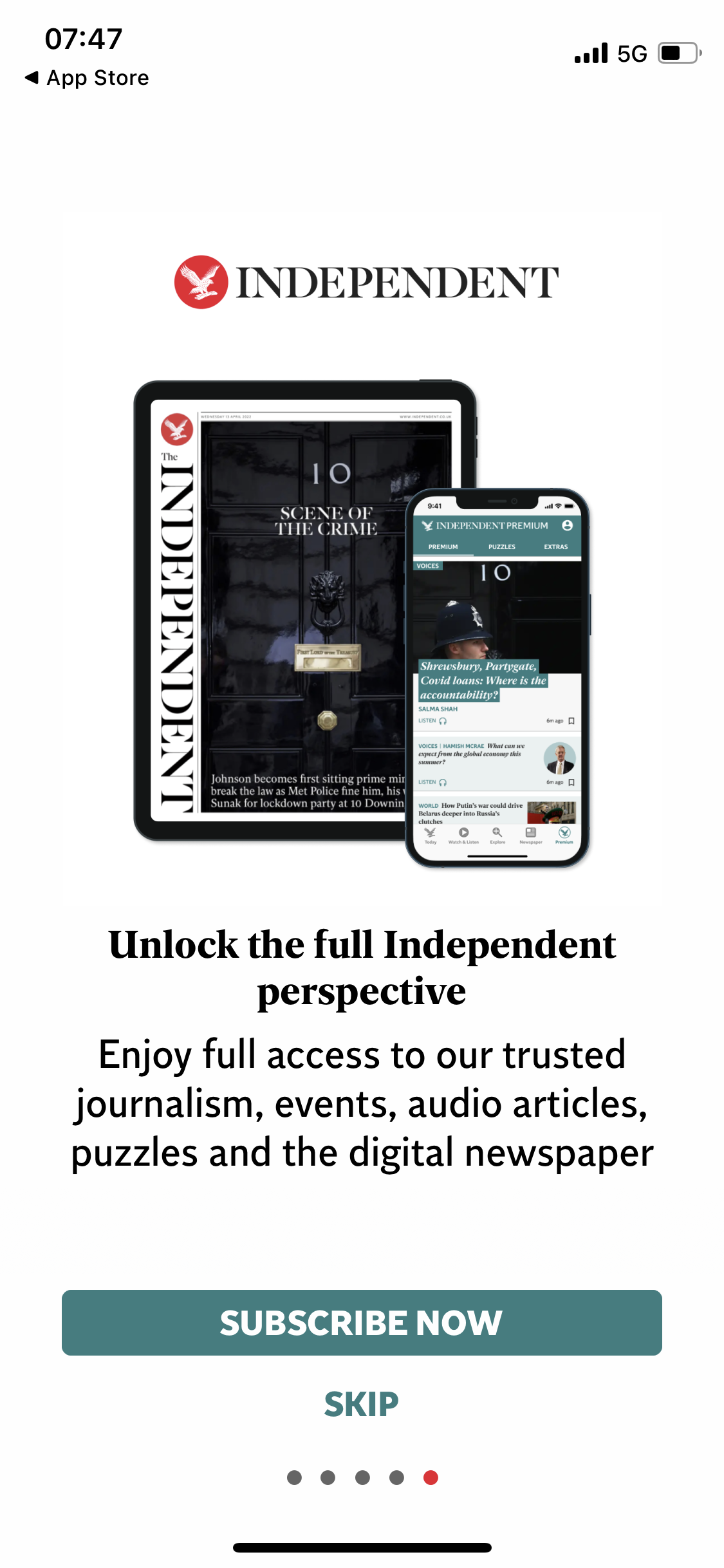 You may decide to present your users with welcome onboarding screens on their first run of the app. These can be used for various purposes, such as showing people how to use the app, but the most common use case we see is to market features you'd like your users to take advantage of such as push notifications and subscriptions.
You can technically have as many screens as you'd like but we'd typically recommend around 3.
Each screen can contain:
- An image
- A title
- A description
- 1 action button
- 1 ‘Next screen’ button
- 1 skip button
Tab bar and tabs
One of the first things a user will notice is the tab bar across the bottom of the app. You'll have a default that the user will land on when they first arrive but there are various different tab types you can choose from. You can have up to 5 tabs within your app, of various or the same types.
Timeline
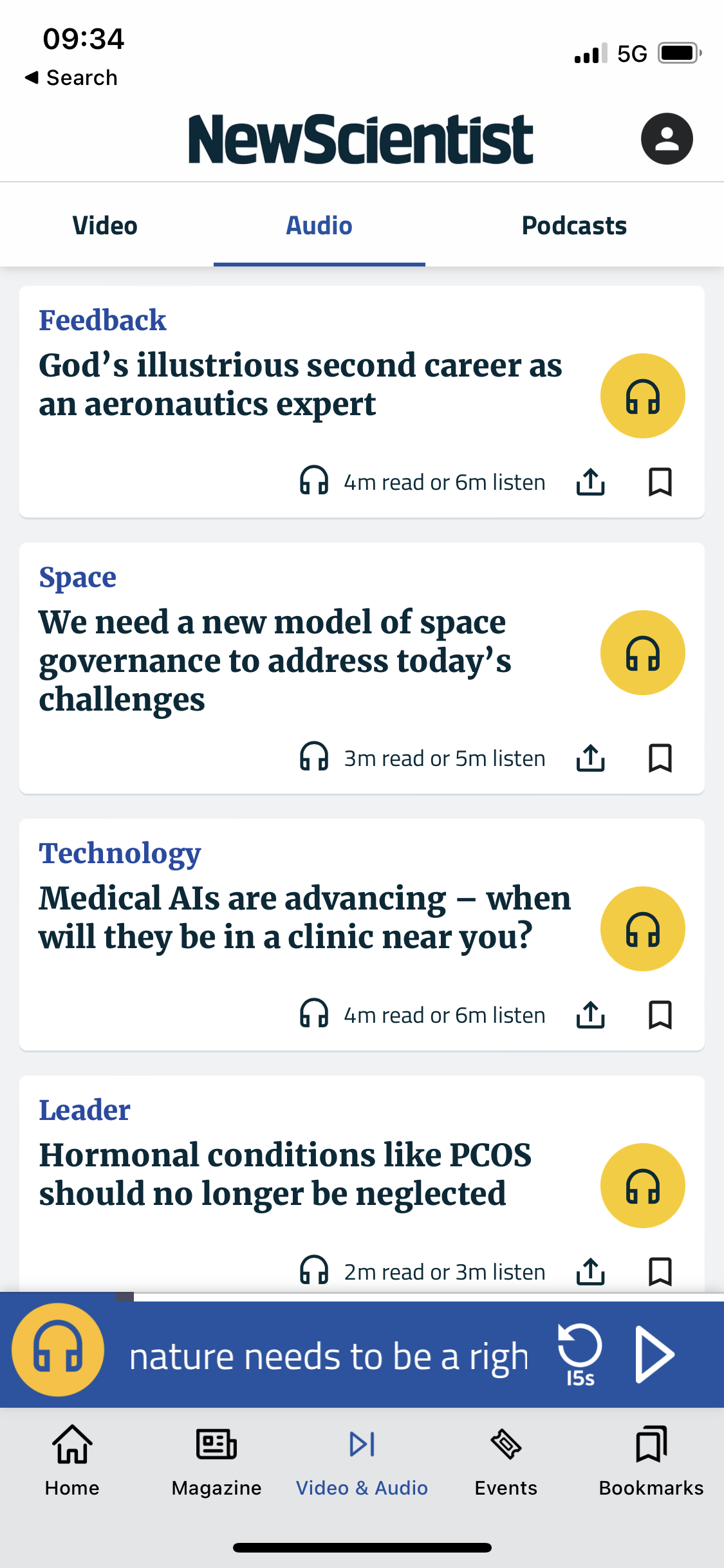
The timeline tab can house various timelines of differing 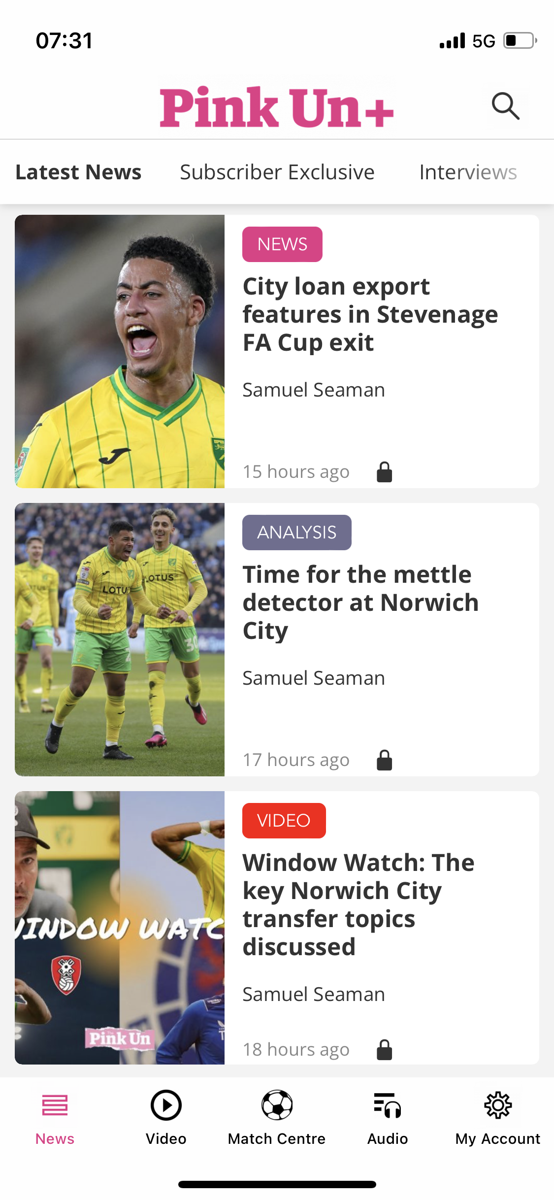 types of news content. You can have multiple timeline tabs or just one. The choice is yours.
Within each timeline a selection of cards is available, ranging from articles, to audio and video. You can have as many different types of cards within one timeline as you like, or you can split them. Each card also comes with a save and a share action icon attached. Articles can even come with an additional text to speech action, if you're subscribed to Amazon Polly.
We have a default card style and layout that we keep up to date, but if desired you can work with our professional services team to create your own.
Timeline picker
If a timeline tab has more than one timeline in it then the tab will have a picker at the top, for users to select between them. The picker shows the title of each timeline, as set in the CMS, and is scrollable so users can browse all timelines. By default the selected timeline will be highlighted in bold.
Storefront
The storefront tab is where users will find edition-based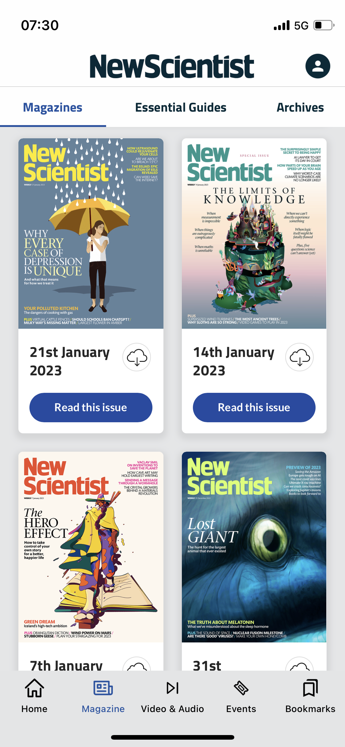 content within your app, whether you have PDF editions, HTML editions, a hybrid format, or all.
Similarly to the picker within the timeline tab, the storefront tab has a filter picker where you can separate your editions.
When on the Storefront, if signed in, users will have the option to either read an edition, or download it to read offline at a later time. If not signed in, when tapping an edition users will be presented with the option to sign in or subscribe, or if you have single issue purchases enabled, to purchase just that edition.
Saved timeline
The saved ‘timeline’ provides a library for users to store their favourite pieces of content within the app. Articles and all other types of content can be saved.
Search
The search tab provides users with another way to look for content rather than scrolling through timelines. There are various ways to adjust weighting of certain types of content and for users to filter their results.
Settings
The settings tab can house a multitude of options, both for you to present information to your users and for your users to customise their in-app experience.
Essentials such as subscriptions and log in can be combined with helpful features such as dark mode, text resize and the choose timeline functionality.
Settings can also house, search, the saved timeline, HTML pages and any link, internal or external.
Webview
You can even have a webview as its own tab, though any interaction on the page that involves a link will take users away from the tab and the app.
Hidden tabs
We also provide the option to have hidden tabs, so if you did want to have more than 5, you could hide the extra ones and link to them from elsewhere in the app.
Toolbar
To ensure the apps remain sleek, and considering the many options in the tab bar, we like to keep the app toolbar simple. You can have your logo at the top as well as one button, at the top right, of your choice. The icon and link behind the button are completely up to you.
Rotation
Pugpig Bolt supports rotation which is most commonly used on tablet devices. We do have the ability to disable it on mobile.
Content views
Naturally users will want to access the content in your app. The appearance and substance of your content will come from your CMS or elsewhere but there are a few influences from the app itself.
If the user doesn't have a valid subscription they'll be greeted by the app paywall, giving them the option to sign in or subscribe.
If they do then what they see depends on the type of content they want to access.
Timelines
If tapping on an article then everything they see will be determined by the content coming into the app. However they will also have 2 options in the toolbar, to either save the article, or share it.
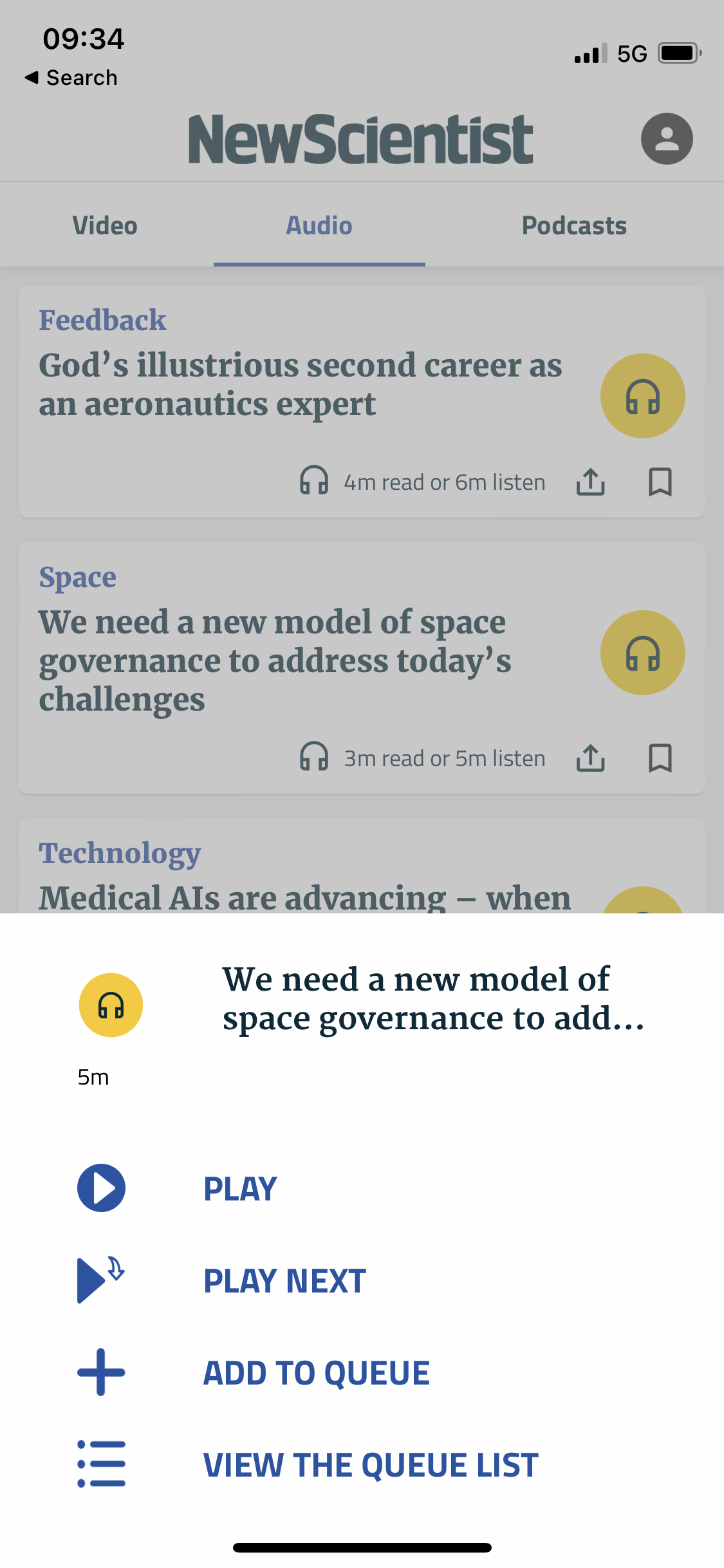
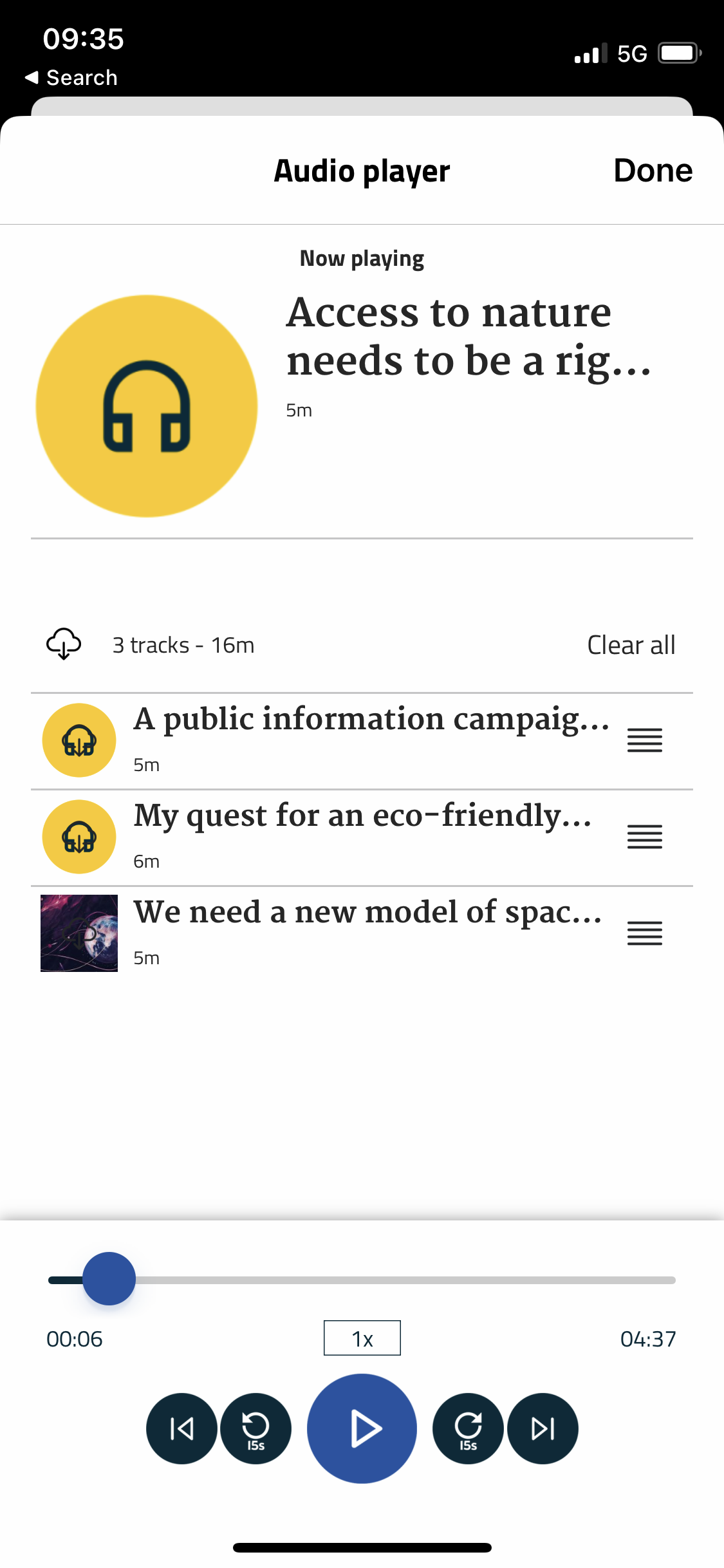
If tapping on an audio card they'll have various options per track, be able to navigate the app while listening by taking advantage of our mini player, or go to our in-app audio player.
 |
 |
 |
Editions
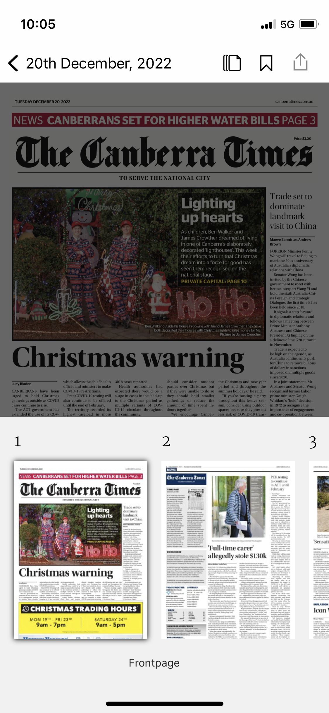
Edition Table of Contents
An initial tap into an edition will take the user into a timeline-styled table of contents with additional features such as collapsible sections. Some clients choose to skip the table of contents, in particular if we do not have useful images or descriptions for each page.
From the ToC you can then tap into a page and see the content as well as the same 2 icons in the toolbar giving the option to save or share.
If you have an Enhanced PDF edition, you can choose if you would like your Table of Contents to list the PDF pages or the HTML pages. Currently this is controlled in the Express CMS on the PDF Importer - this sets “Hide from ToC” for the pages you do not want to show.
Improvements for the Table of Contents
At present, when you reopen the Table of Contents from within an edition, it defaults to the first article. We are working on an improvement to ensure the ToC remembers and highlights the article you were on.
Edition Scrubber
Additionally, if enabled, users may see the edition scrubber, giving another way to navigate the edition, as well as the ToC, or timeline.
More information
If you're interested in more detailed information about design and configuration elements of each feature then click through to the above hyperlinked sections.