Designing for your Pugpig app

Written by Lucy Fairhurst
Updated at October 23rd, 2025


Pugpig Bolt is a hybrid app product. This means there are web technologies (ie. HTML, CSS and JavaScript) used within a native app container.
Theming the native container
The native portion of the apps are developed using elements that iOS and Android provide (where possible), which means their UI looks more consistent with their platform. We support theming of these areas so you can apply colours, fonts and assets to the native containers. There is a standard look and feel across the Pugpig Bolt product, so it is not necessary to build custom designs for these areas. Some of the native and themeable areas are included below:
- Welcome screens
- Toolbar (figure 1 - indicated in blue)
- Edition scrubber
- Bottom tab bar (figure 1 - indicated in green)
- Settings screen
- Paywall
- Storefront
- Search
- Saved
- Term picker (follow)
- Audio player
Theming the native elements
We will need you to supply the following:
- Brand colours (in hex ref) and what parts of the app they should apply to. If you would like us to enable dark mode, please also provide the colour palette you would like us to use - or we can infer it from your brand colours
- Fonts (in .ttf or .otf) and where each font should apply to in the app
- Assets e.g logo (176px high, transparent background png) and app icon (1024x1024px png)
- You can provide your own icons for the tab bar if you wish, or use our defaults
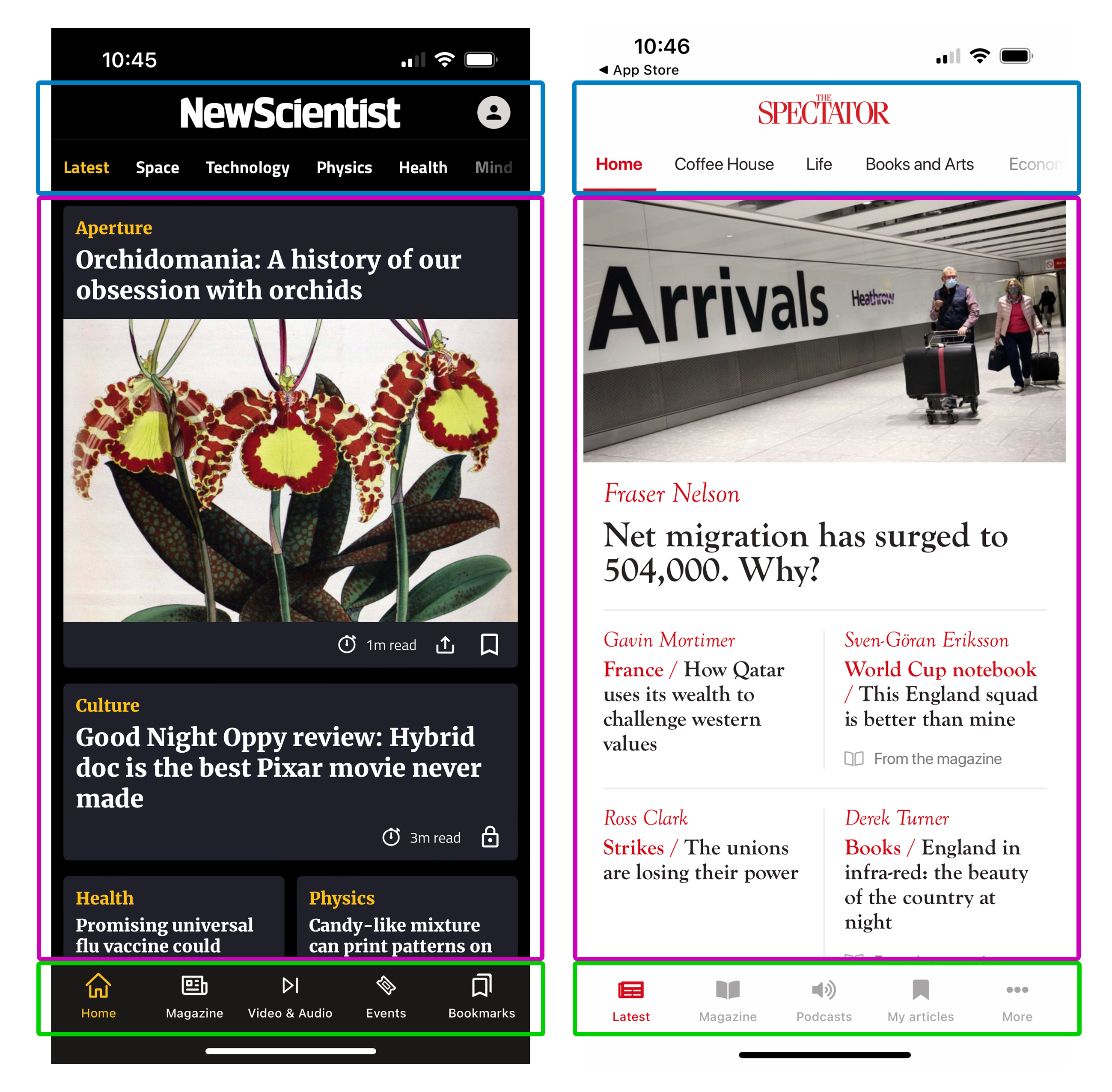
Figure 1. Toolbar, timeline cards and tab bar
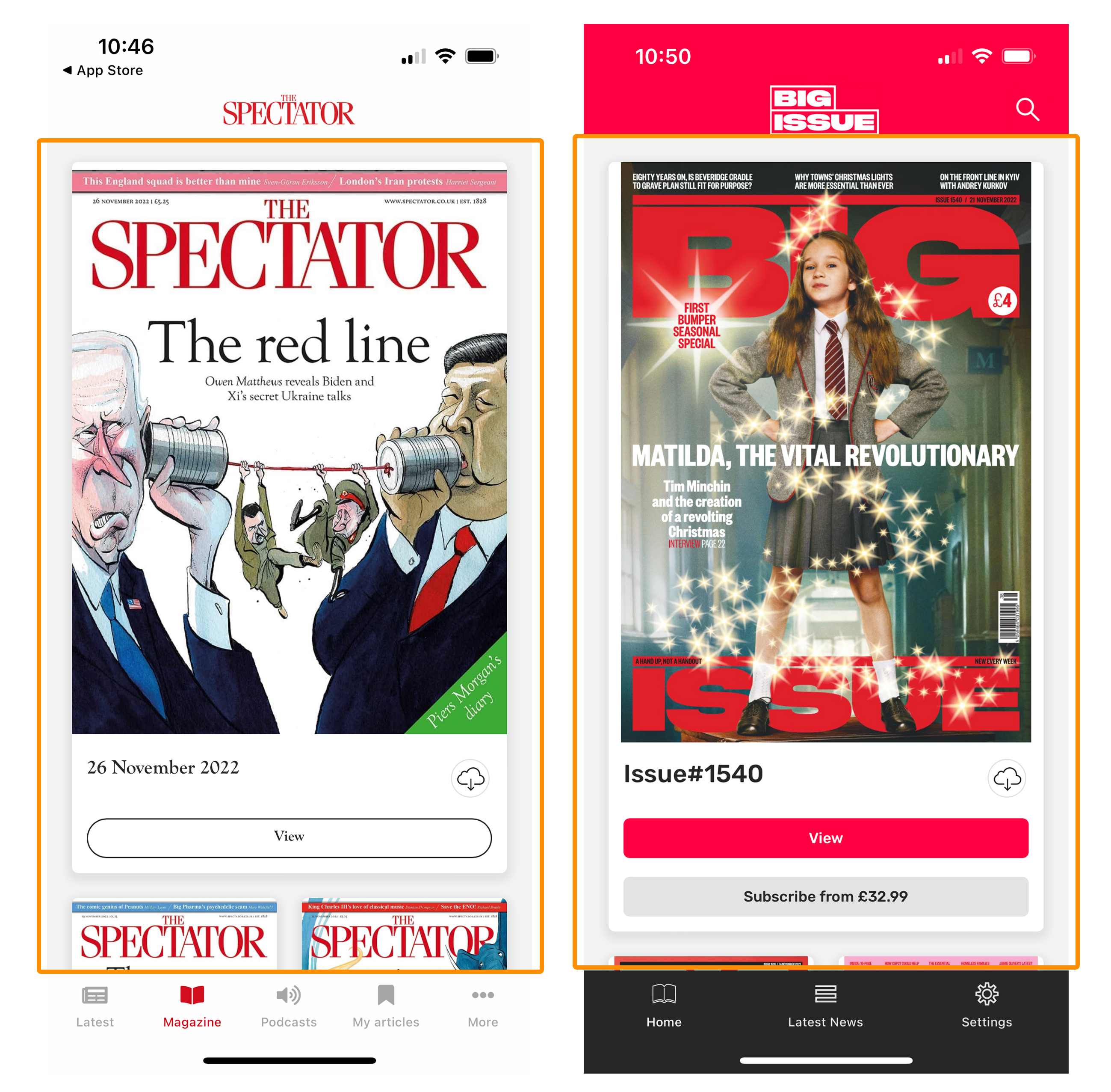 Figure 2. Storefront screens
Designing cards and templates
Using HTML, CSS and Javascript for our article templates and timelines gives us more flexibility when it comes to styling and branding the apps. Here are the following things you can design:
- Timeline cards (figure 1 - indicated in pink)
- Can be different per card type
- Can be different per timeline
- You can design from a set of out the box cards
- You can also design custom cards (if applicable) that may contain additional information that a product card cannot support
- Edition table of contents
- Can be different per card type
- Article templates
- Can have multiple templates with different styles applied
- We also support different content types e.g events
Storefronts
The storefront offers limited customisation out-of-the-box, including all colours, fonts, copy and icons. Elements that offer less customisation are detailed below:
- The arrangement and sizing of covers is fixed
- The presence, position and shape of the view button, download button and edition name
All of the above can be changed with custom css, which would be undertaken by our professional services teams
Things Pugpig look at when reviewing a design:
- Initially we look at whether it can be built using our 'out-the-box' templates and timeline cards as a base. Styling cards/articles that use our out-of-the-box product are usually quicker to develop. Anything custom will take more time/effort to build and maintain (and will need to be estimated on too).
- We'll usually ask if something is feed driven (typically RSS). This can mean additional information is likely to be passed in the feed that will need styling. Providing a list and design of these elements is useful. We will also discuss with you how any layout or design options can be driven by the feed (e.g. driving the use of different card types for different content from the feed)