Bolt Paywall customisation

Written by Benji Weiser
Updated at March 28th, 2024


This article highlights the appearance customisation available within the app paywall. Please see this article for the paywall overview.
Theming
You can choose all of the colours and fonts on the paywall, as well as the logo, though initially these will inherit the theming of the rest of the app to appear cohesive and this is often sufficient.
Buttons
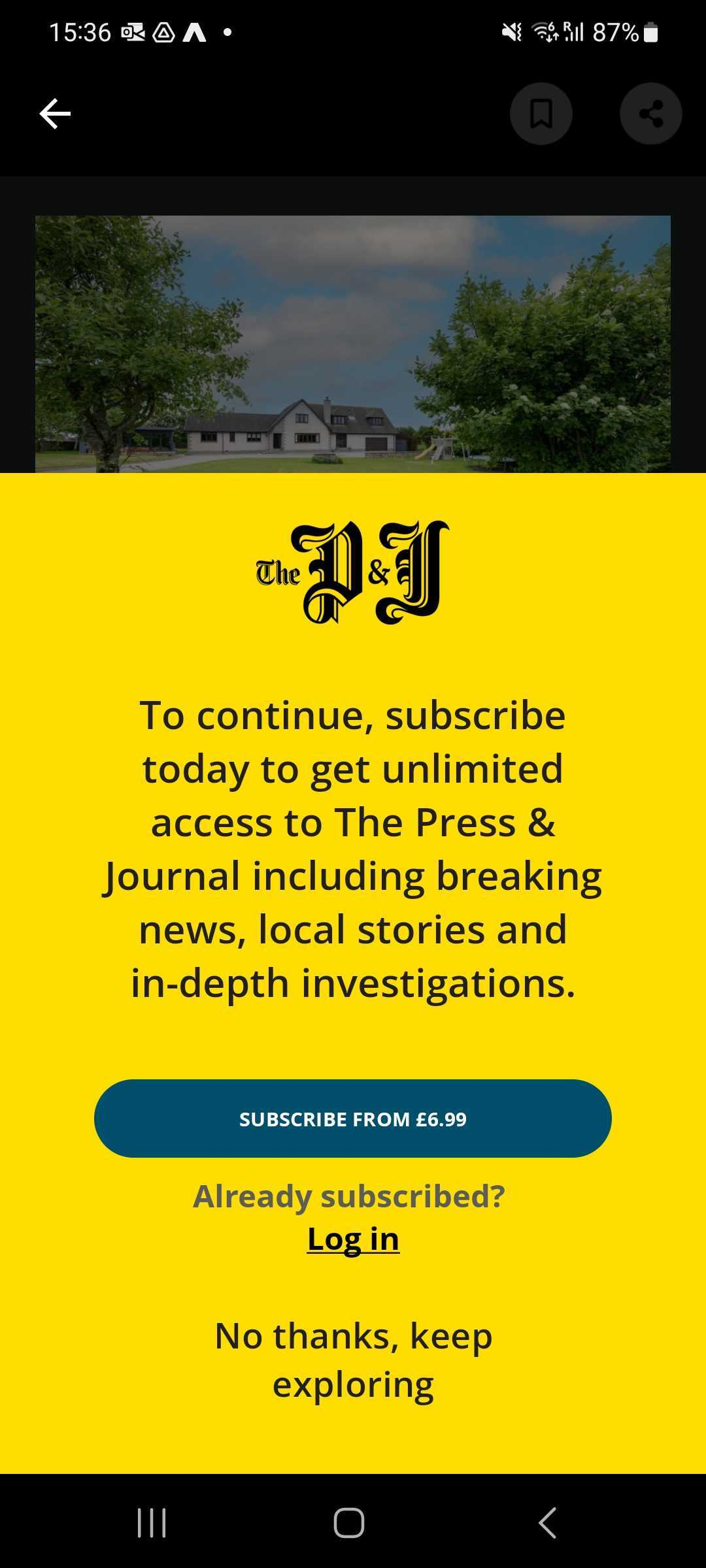
The order, size and shape of the buttons is fixed. We display only the buttons that are relevant to the user and app. They can be themed independently of one another.
- In app purchase: this button will appear if there are IAPs configured and available. This links to our subscription modal where the user can choose and purchase any available subscription.
- 3rd party authentication: this button will appear if an auth service is configured and the user is not already signed in. This launches the sign in flow in a separate view.
- Cancel button, this closes the paywall and returns the user to where they were prior to invoking it.
Copy
The copy on the paywall is drawn from several places, this is to ensure it’s as relevant as possible to the user and their situation. These are listed below. All of these are localised in our supported languages.
Introduction or IAP upgrade message
If the user is completely anonymous (not registered, signed in or subscribed) then this is used to explain to the user why they’re seeing the paywall and what their options are. It will always appear when the paywall is shown and is always the same, regardless of the reason the paywall is shown.
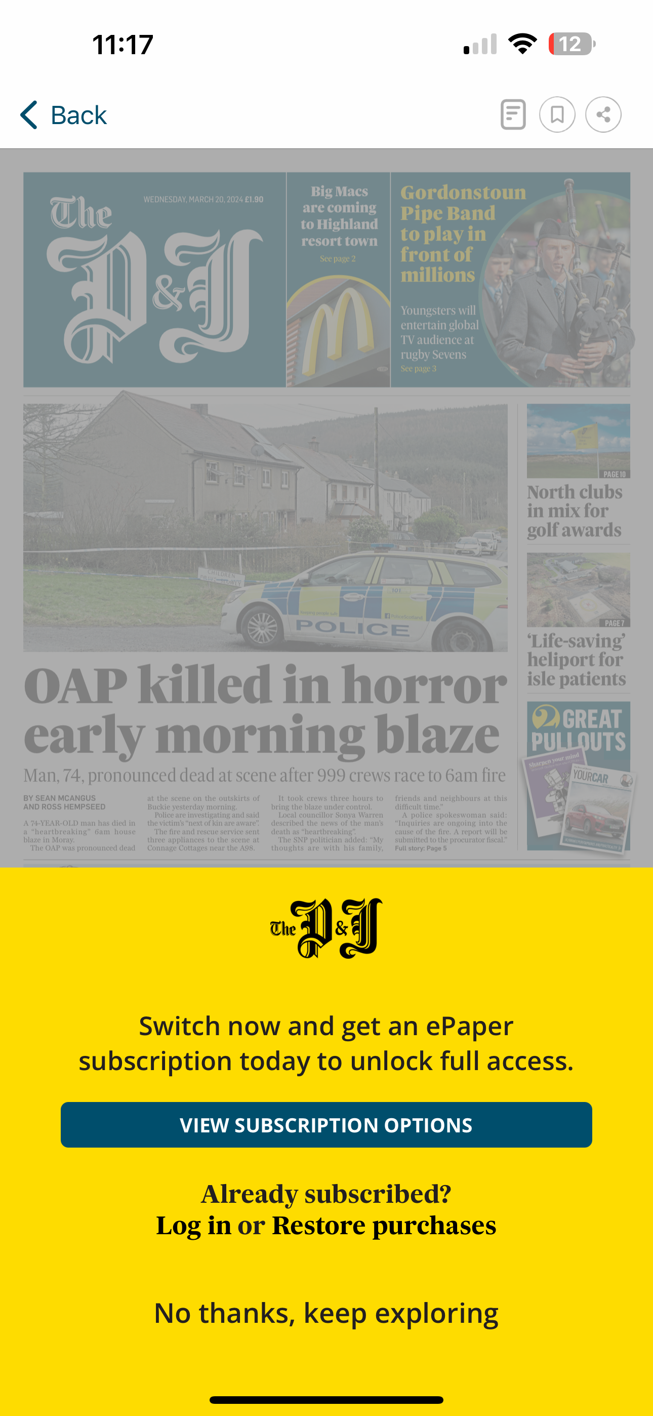
If the user is subscribed via the app store with a lower tier than is needed for the content they're trying to access, they'll instead be presented with a configurable upgrade message.
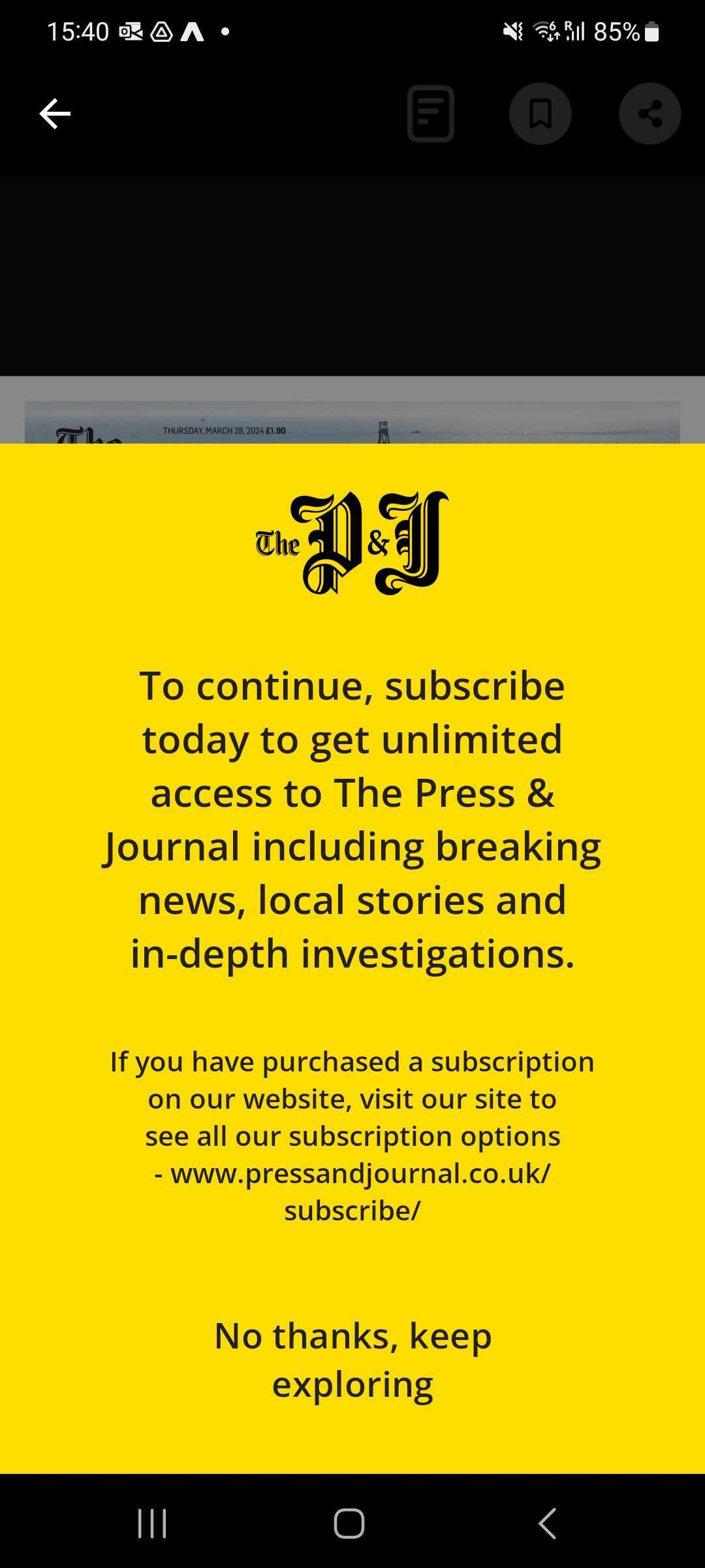
Authorisation status message or authorisation upgrade message
This only appears in the case of a user who is signed-in but is not entitled to the content. If the auth response contains an upgrade message then we'll show that, but if not then we'll display the status message.
Common examples include users who have cancelled their subscription, but still have an account. Or users who have a basic subscription, but not premium. In this case we also display the in app purchase button, as a way for them to gain access.
The authorisation message is only driven by the response from the authorisation service. It can not currently get any information from the type of content the user is trying to access.
For example
- You can say "You have basic access and need to upgrade to read more.
- You can not say "You need premium access to read this content".
Note that the status and upgrade messages are 2 separate messages and both can be sent in your auth response. The status message will always be shown on the settings page as a confirmation after signing in and on the paywall if the upgrade message does not exist. The upgrade message will be shown on the paywall if available.
IAP button or IAP upgrade button
The price here is pulled from the relevant App Store (App Store Connect or Google Play) and takes into account the users eligibility for introductory pricing, so should always accurately reflect the lowest price they’ll pay. This can overwritten to just be a normal string, and not feature pricing information. Prices will be localised to the user’s app store currency.
If the user is subscribed to a lower tier as part of subscription levels, they'll be presented with an upgrade button.
Sign in button
The third party authentication sign in button. If your authentication service uses a specific identifier (such as member number) in lieu of a standard email-password combination it can be wise to explain that here. i.e. “Sign in with member number”, but be mindful of the limited space a button provides.
Cancel button
This usually just says "Cancel" but can be changed if you wish.
Examples
 |
 |
 |
All strings set in the app can be changed serverside with a new config, but note that a user will have to open the app to download the config and it will be applied the next time the user opens it.