Dark mode
Table of Contents
Dark mode in Bolt
Pugpig Bolt has an optional dark mode feature that can be added to your app settings page.
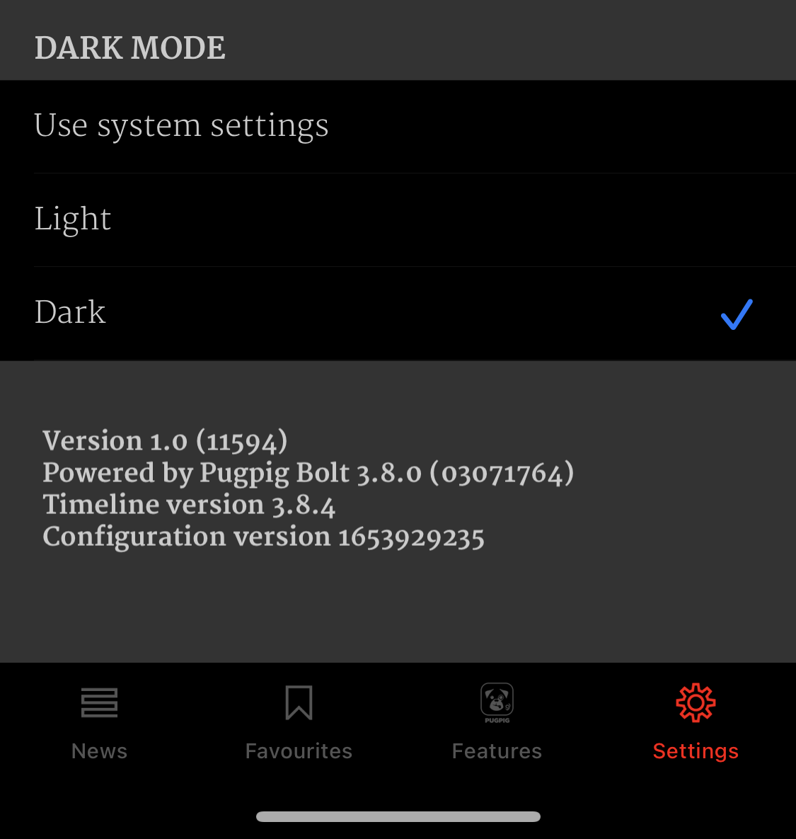
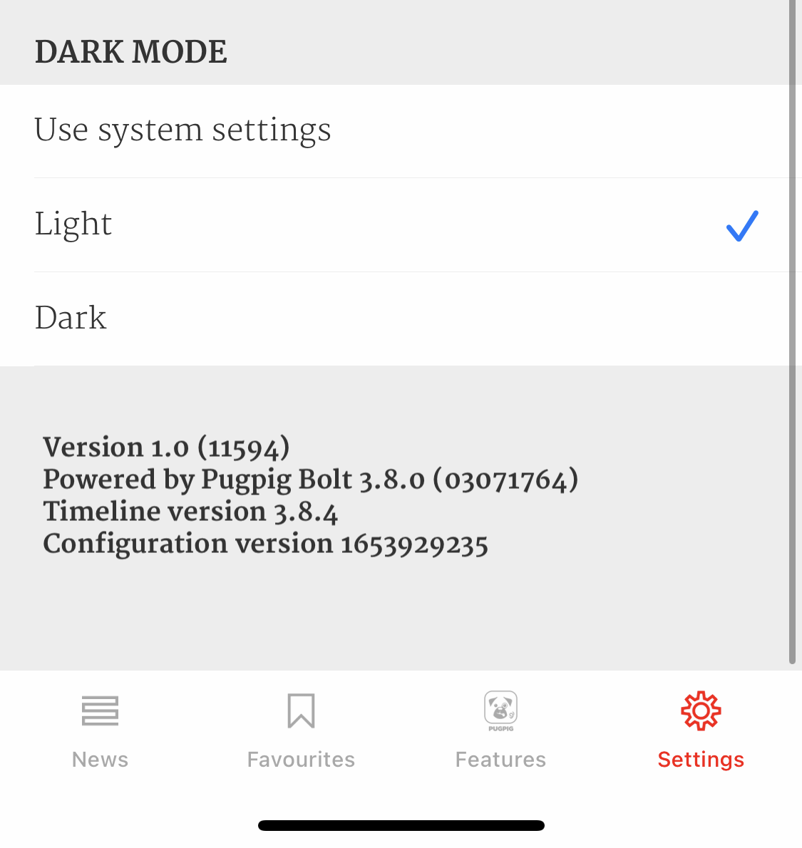
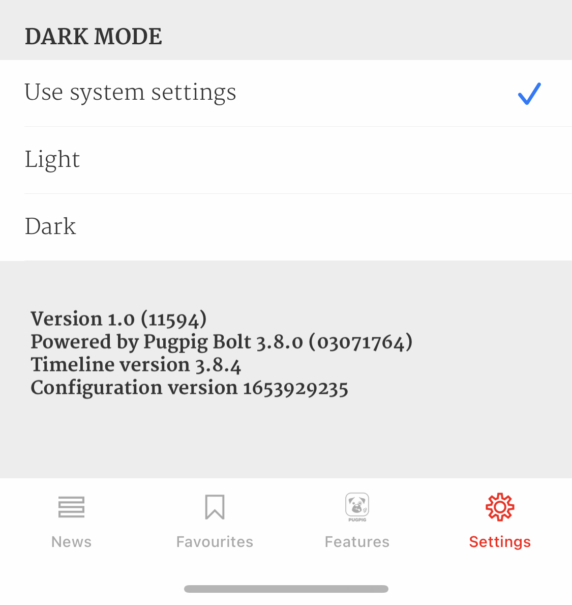
The settings item has 3 options, as shown in the screenshots below:
- Use system settings, which will default to the light/dark mode settings of the device,
- Light,
- Dark.


Everything in the app which can be styled normally can also have its own dark mode styling, from toolbars and settings pages to timelines and HTML content.
As with other app container theme changes, adding dark mode and the settings item requires a new app config. Dark mode CSS will be automatically applied to HTML content coming from the Pugpig Express CMS (Minimal theme only). It is likely, if custom styling is used, that additional dark mode styling will need to be applied to handle the custom CSS on the template.
Embedded Web Views and Iframes
The app sets the appropriate information to support the prefers-color-scheme media query (https://developer.mozilla.org/en-US/docs/Web/CSS/@media/prefers-color-scheme). We strongly recommend your website uses media queries to detect dark mode (rather than custom Javascript).
If users are using the system dark mode setting this will also be respected if you use media query detection.
It is important that you have an explicit background colour on your website set for both Dark Mode and Light Mode. If you do not, your page will display the Pugpig theme background colour.
Accessibility
It's important to factor in colour contrast for accessibility when dark mode is enabled. It is common that brand colours may not pass accessibility testing when used in conjunction with a darker background colour. There are many online tools available to help you test different combinations of colours - we like Colour Contrast Checker.
Please reach out to Pugpig Support, or your Customer Success Manager if you'd like to know more about dark mode or are interested in adding it to your app.


