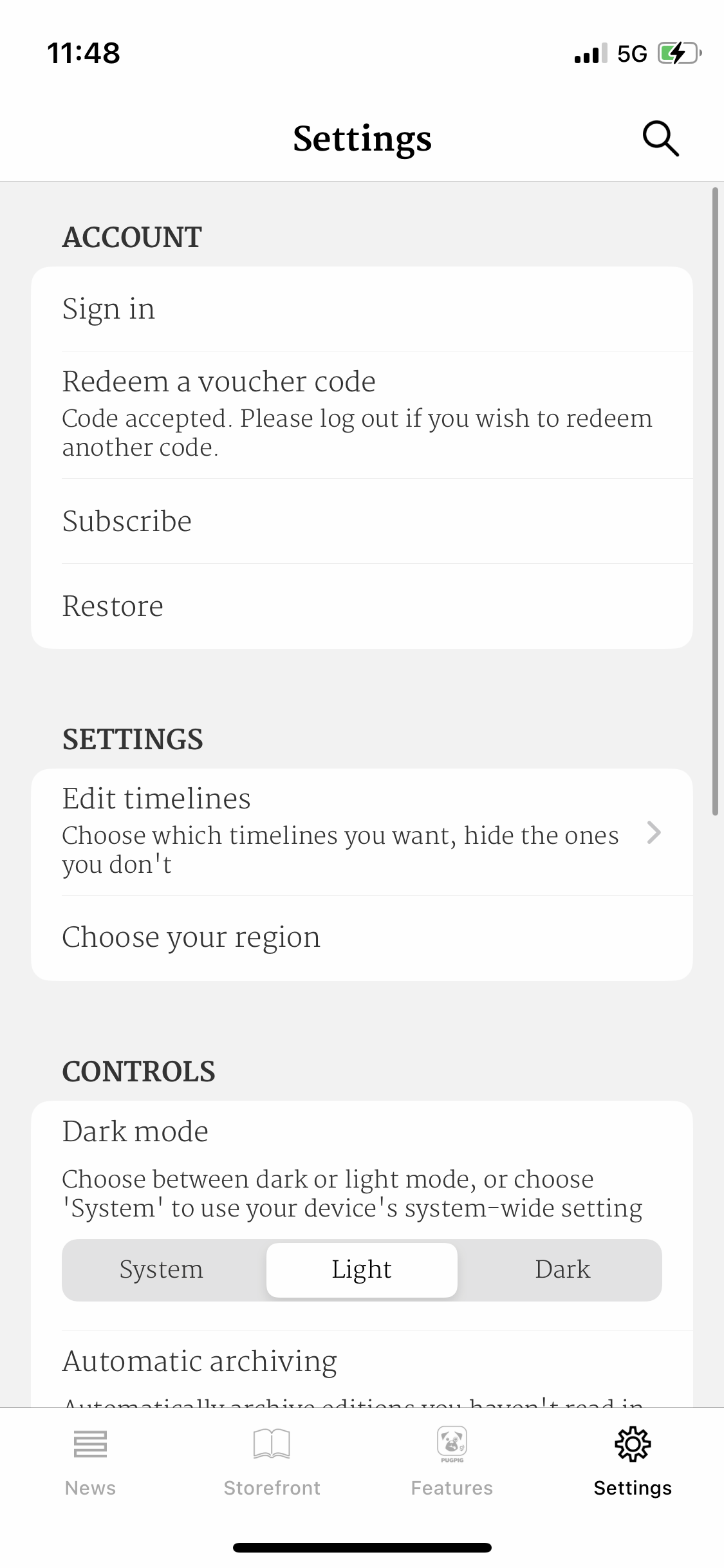
Bolt settings options
Table of Contents
The Bolt settings tab can house a multitude of options, both for you to present information to your users and for your users to customise their in-app experience. It has account options, traditional settings options and even debugging options, making it an almost essential part of the app.
Positioning
As settings is a tab, the most common place it's located is usually in the tab bar at the bottom of the app. It can fill any of the 5 available slots but it's usually found on the far right (or far left for right to left apps).
As well as in the tab bar, you have the ability to have settings as a toolbar icon at the top right of the app.
Layout and appearance

Layout
Your settings page can be split into as many sections as you'd like, which can be particularly useful for highlighting the difference between account-related options and user customisation options. You can give these sections titles, or not, that's up to you.
Appearance
As for styling you have a few options to change:
- The background colour
- The separating line between each settings item
- Section header font and font colour (Note - the capitalisation is unchangeable as we use the OS settings options)
- Settings item font, font colour and background colour
- Toolbar background colour, font and font colour
Options
Here is what it can include:
- Custom banner - This is an optional image, text and CTA button that can be displayed at the top of the settings area and controlled server side.
- Account - This will include any third party sign in and/or app store subscription options.
- Dark mode - Choose whether the app is in light or dark mode.
- Saved - The page that any saved content can be found in. It can also be included as a tab
- Search - Our search feature which can also be included as a tab.
- Edit timelines - This can be used by your users to reorder or hide timelines.
- Push preference centre - Users can choose topics to be opted in to for push notifications (OneSignal customers only for now)
- Double page reading mode - Users can choose whether to see single or double pages when reading in landscape.
- Edition archive and download settings - Used to control how long before editions automatically delete.
- Text resize - Control the text size of articles.
- Internal links - These can be used to take users to any part of the app, including help screens.
- External links - These will take a user outside of the app, for example to your privacy policy or T&Cs.
- Webview pages - Rather than link out of the app you can embed pages as webviews within the app.
- App share - Share a link to the app with others.


